In this post I will show you how to create block styles that will allow for uniform, responsive use of the core spacer block. Using this method solves multiple issues when building out sites using the block editor.
This method brings a bit of a modern approach compared to my previous way of creating responsive spacer blocks. If you aren’t sure what block styles are, check out Bill Erickson’s posts here.
- Consistency. Many times, when using spacer blocks to add spacing, the spacing becomes inconsistent. Users may add 50px on one page and 40px on another page and so on. This method ensures consistency in spacing throughout your site.
- Responsiveness. Out-of-the-box the spacer block is a fixed height. This won’t work if you need a large amount of space that won’t work well responsively. This method allows the spacer block to become responsive using CSS clamp.
Register the block styles
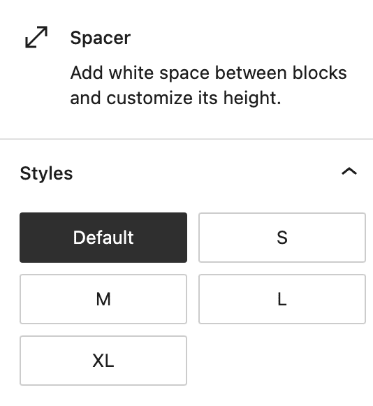
The first step is to register the blocks styles. This will make them available to use within the block editor. We will create small, medium, large and extra large options, but you can modify this to your needs.
<?php
wp.domReady( () => {

     wp.blocks.registerBlockStyle(
          'core/spacer',
          [
               {
                    name: 'default',
                    label: 'Default',
                    isDefault: true,
               },
               {
                    name: 'small',
                    label: 'S',
               },
               {
                    name: 'medium',
                    label: 'M',
               },
               {
                    name: 'large',
                    label: 'L',
               },
               {
                    name: 'x-large',
                    label: 'XL',
               }
          ]
     );

} );
The code above should be added in a javascript file that is enqueued in the block editor. Here is the function I use to accomplish that. You’ll want to edit the URL to point to the location of your javascript file.
<?php
/**
 * Block editor scripts
 */
function wd_admin_enqueues() {

     // custom block styles
     wp_enqueue_script(
          'wd-editor',
          get_stylesheet_directory_uri() . '/assets/js/editor-min.js',
          [ 'wp-blocks', 'wp-dom' ],
          filemtime( get_stylesheet_directory() . '/assets/js/editor-min.js' ),
          true
     );
}
add_action( 'enqueue_block_editor_assets', 'wd_admin_enqueues' );
Once that is complete you should see the block styles available within the editor:
Style each spacer block style with CSS clamp
Now that each block style is available in the editor we’ll add some CSS to create our responsive spacer block. We are going to use CSS clamp, which essentially “clamps” the property between an upper and a lower bound.
The markup includes a min-value, preferred value and max value. You’ll need to play around with the “preferred value” a bit to get it work best for your case. For a more detailed explanation of CSS clamp go here.
Here is the CSS used for my default set up:
.wp-block-spacer {
     margin-top: 0;
     margin-bottom: 0;

     &.is-style-small {
          height: clamp(12px, 3vw, 36px) !important;
     }

     &.is-style-medium {
          height: clamp(24px, 5vw, 48px) !important;
     }

     &.is-style-large {
          height: clamp(36px, 8vw, 72px) !important;
     }

     &.is-style-x-large {
          height: clamp(36px, 9vw, 96px) !important;
     }
}
Note that I use SASS so you would need to extrapolate this out to CSS if you aren’t using a compiler.
You’ll see each block style has a minimum and maximum height which is defined by the first (minimum) and third (maximum) property in the clamp values. The spacer will never be smaller than the minimum value (mobile) and never be taller than the maximum value (desktop).
Instead of defining specific breakpoints which cause the height to change each time a specific width is met, this will create a fluid scaling of the height as the viewport changes sizes.
One last note, typically you will want to avoid using !important at all costs. Unfortunately, the block editor adds the height of the spacer block inline, which we can’t override unless we add the !important declaration.
Thank you for this Matt! I’m implementing and tweaking my CSS for a current project. This is definitely a needed piece for Gutenberg spacers. Have a great weekend!