Update 8/17/2022 – I use a newer method found here for responsive spacer blocks, but this method still works well!
One of my favorite blocks to use is the Spacer Block. It is a quick and easy way to add uniform spacing throughout the site as needed without coding extra divs or adding random margins and padding. In this post we’ll go over how to make these responsive to ensure your spacing is consistent throughout your site at all screen sizes.
What is the benefit to responsive Gutenberg Spacer Blocks?
While it may seem at first glance that there isn’t much benefit in this, I believe there is! As a simple example, let’s say you add a 100px spacer block between each image on a page. While this may look great on desktop and even tablet, as you get to mobile, 100px of space is a lot.
The problem is that the spacer block doesn’t have a unique class to target with CSS and uses in-line CSS to define the height you choose. The only way to target specific spacer blocks would be by manually adding custom classes or using Block Styles.
Using custom block styles will allow you to define a set height for your spacer blocks that will be simple for the user to edit and easy for you to manage. I use a similar technique to add block styles to lists to ensure lists have consistent font sizing.
Define the Custom Block Styles
The first thing we need to do is define the custom block styles. I won’t go in to a lot of depth about this portion but you can reference Bill Erickson’s great post on Block Styles for more detailed information on how to enqueue block styles.
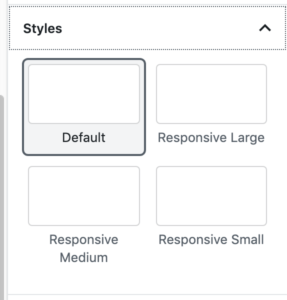
You are welcome to add as many, or as few, options as you’d like here. For simplicity, I’ll keep it to small, medium and large. Additionally, we need a default option as Gutenberg doesn’t allow you to remove a block style…so if you accidentally added a style, you need a way to take it off.
<?php
// Add custom button styles
wp.domReady( () => {

	wp.blocks.registerBlockStyle( 'core/spacer', {
		name: 'default',
		label: 'Default',
		isDefault: true,
	});

	wp.blocks.registerBlockStyle( 'core/spacer', {
		name: 'responsive-large',
		label: 'Responsive Large',
	} );

     wp.blocks.registerBlockStyle( 'core/spacer', {
		name: 'responsive-medium',
		label: 'Responsive Medium',
	} );

     wp.blocks.registerBlockStyle( 'core/spacer', {
		name: 'responsive-small',
		label: 'Responsive Small',
	} );

} );
After you have added this and properly enqueue’d your editor javascript you will have the following options when editing the spacer block:
Styling our New Custom Gutenberg Spacer Block Styles
When you add block styles all it really does it make it simple to add pre-defined classes to items. So when you choose any of our newly defined block styles a class of is-style-name-of-style will be added to that specific item Using these classes we can now define our custom responsive CSS.
.wp-block-spacer {

     @media(max-width:1000px) {
          &.is-style-responsive-large {
               height: 100px !important;
          }

          &.is-style-responsive-medium {
               height: 60px !important;
          }

          &.is-style-responsive-small {
               height: 30px !important;
          }
     }

     @media(max-width:600px) {
          &.is-style-responsive-large {
               height: 60px !important;
          }

          &.is-style-responsive-medium {
               height: 40px !important;
          }

          &.is-style-responsive-small {
               height: 20px !important;
          }
     }
}
Using the SASS above we are targeting breakpoints of 1000px and 600px to automatically resize each custom block style to a pre-defined height. This allows us to globally choose all spacer blocks using the custom block styles regardless of their defined height to make sure spacing is consistent as we scale down in screen size.
Depending on your project you can easily change/add/remove different media queries and sizes to accomplish the desired layout. Here is the CSS version of the same code:
@media(max-width:1000px) {
     .wp-block-spacer.is-style-responsive-large {
          height: 100px !important;
     }
     .wp-block-spacer.is-style-responsive-medium {
          height: 60px !important;
     }
     .wp-block-spacer.is-style-responsive-small {
          height: 30px !important;
     }
}

@media(max-width:600px) {
     .wp-block-spacer.is-style-responsive-large {
          height: 60px !important;
     }
     .wp-block-spacer.is-style-responsive-medium {
          height: 40px !important;
     }
     .wp-block-spacer.is-style-responsive-small {
          height: 20px !important;
     }
}
Note: Typically using !important in CSS is frowned upon, and I agree it should be used sparingly. In this case, since the CSS is in-line we need to use !important to override it.
And that’s all there is to it! To sum things up, we enqueues specific custom block styles for the spacer block and applied custom CSS to define specific heights based on the screen size and the chose block style.
Hopefully this helps you keep things consistent in your next project using the very helpful spacer block.
this is what css is for—using a spacer block is akin to typing return twice to add space or adding line breaks/empty ‘s in html.
Surely more consistent to define in css rather than trying to remember what size space to use, knowing that if you change the spacing on in one instance you then have to go and change it everywhere.
The spacer block is the solution to adding random line breaks as you DO have CSS control over it. Adding random empty line breaks, as you suggest, is a terrible solution as you do NOT have any granular control over it across different screen sizes.
Have you used the Gutenberg editor to build client sites? The spacer block is a very valuable tool, and this post defines how to create control over it to create a uniform way.
While I agree that CSS should be used to handle the bulk, if not all, of the spacing, after building with Gutenberg non-stop the past year, the spacer block certainly has its place IMO.
Additionally, the spacer block should not be used in a way where you have to edit it across a bunch of different sections of the site. It should be used as a one-off solution where additional space is needed. It isn’t used, for example, below the content of each page to add spacing.
Related to adding new options. I have been trying to find a way to remove the default options from blocks.
Example in the spacer-case, I would like to remove the option to define height in pixels. Any idea if that is possible or not?
Hey Timo. In a similar fashion to registerBlockStyles you can unregisterBlockStyles. While this will remove blockStyles it won’t remove options within the block (like the ability to change pixels). That would be a whole different can of worms. I haven’t researched or done that before. If you’re interested in the blockStyles specifically, here is the code from my starter there where I remove some core style options:
https://github.com/mwhiteley16/genesis-base-child-theme/blob/master/assets/js/editor.js
Thanks for the reply. Yea I’m looking exactly that can of worms…I assume there would be filters to be able to that. Keeping on googling it….
Did you find the answer eventually?
The filter you want is this one:
https://developer.wordpress.org/reference/hooks/block_editor_settings_all/
While I can’t specifically say how to remove that property, I’ve used that filter to remove settings from other blocks, so it is just about finding the right thing to target. Best of luck!
Thanks for this useful tutorial. I’m using the Gutenberg blocks and love this plugin.