My custom starter theme has a “page options” section on all pages that includes an option to manually select a page layout. This gives the user granular control over the page layout they’d like to use on a per-page basis.
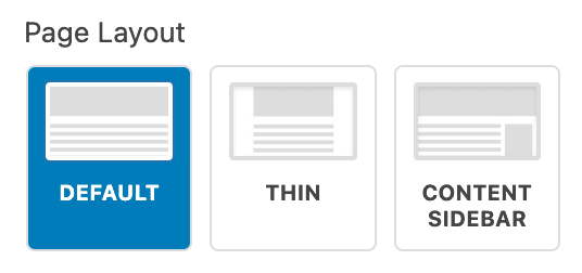
I wanted this to be a little bit nicer than just a standard select or radio field so in this tutorial I will show you how I customized the radio button so my page layout field now looks like this:
Note: I am using Advanced Custom Fields to create these fields so this method is specific to styling Advanced Custom Fields options in the page sidebar.
Styling the Radio Buttons
First, I create styles for the buttons. Here is the CSS being used:
Note: I am using SASS. If you aren’t using SASS you’ll need to re-create this in vanilla CSS.
.edit-post-sidebar {
     font-family: -apple-system,BlinkMacSystemFont,"Segoe UI",Roboto,Oxygen-Sans,Ubuntu,Cantarell,"Helvetica Neue",sans-serif;
     font-size: 13px;
     line-height: 1.4em;

     .acf-field[data-name="wd_page_layout"] {

		 ul.acf-radio-list {
			 display: flex;
			 flex-wrap: wrap;

			 li {
				 width: calc(calc(100% - 16px) / 3);
				 margin: 0 8px 8px 0;
				 border: 1px solid #ddd;
				 border-radius: 4px;
				 overflow: hidden;
				 display: flex;

				 &:nth-child(3n) {
					 margin-right: 0;
				 }

				 label {
					 display: flex;
					 width: 100%;
					 justify-content: center;
					 padding: 52px 8px 8px;
					 text-align: center;
					 line-height: 1.2;
					 font-size: 10px;
					 text-transform: uppercase;
					 font-weight: 700;

					 &.selected {
						 background-color: var(--wp-admin-theme-color);
						 color: white;
					 }

					 input[type="radio"] {
						 position: absolute;
						 top: 8px;
						 left: 8px;
						 width: calc(100% - 16px);
						 height: 36px;
						 background-image: url('../images/admin/layout-icon-default.jpg');
						 background-size: cover;
						 border: 2px solid #ddd;
						 border-radius: 2px;
						 overflow: hidden;
						 color: #555;

						 &[value="thin"] {
							 background-image: url('../images/admin/layout-icon-thin.jpg');
						 }

						 &[value="content-sidebar"] {
							 background-image: url('../images/admin/layout-icon-content-sidebar.jpg');
						 }

						 &:checked {
							 border-color: white;

							 &::before {
								 display: none;
							 }
						 }
					 }
				 }
			 }
		 }
     }
}
Now l’ll walk through each piece of this css:
We start by wrapping the entire block in the .edit-post-sidebar class. This ensures we are only targeting the editor sidebar. If you’d like to use this elsewhere on the site, you’d need to update that class as needed.
Next, I target the ACF field with a value of .acf-field[data-name="wd_page_layout"]. This ensures the styles are only used on the ACF field with the meta key of wd_page_layout. You will need to change this to whatever your ACF meta key is for the field you are targeting.
Then I give the ul that wraps the radio items a flex layout that wraps and style each li to have a 33% width with an 8px gap. This creates a nice, simple three-column layout for the buttons.
Next, I give the label, which wraps the actual input, font styles and padding. The padding has an extra 44px at the top, which will give space for the graphic we’ll use in the next step.
Now I style the input by absolutely positioning it with a specific height and width to fit within the extra padded area in the label and set a background image to cover that area. The background image is a simple custom graphic I created, but you could use anything here. You would just need to adjust the padding on the label element to get the proper aspect ratio for the image.
I then add two additional variations to the input; one for each of the additional style options which swaps out for the appropriate image. If there were more than three layout options, I would add more as needed. I target each radio by targeting the value of the input (ie [value="thin"]).
Finally, we add some CSS to adjust the background and colors for the selected, or checked, option. Notice I’m using var(--wp-admin-theme-color) for the background color to ensure the color matches the current admin color.
Note: ACF automatically adds the selected class to the label when it is checked.
Register the Styles
Now that the styles have been created we need to make sure we load them in the WordPress admin. Below is the function used to do that.
<?php
/**
 * Admin scripts
 */
function wd_admin_style() {

     wp_enqueue_style(
          'admin-styles',
          get_stylesheet_directory_uri().'/assets/css/admin.css',
          [],
          filemtime( get_stylesheet_directory() . '/assets/css/admin.css' ) // append timestamp for cache busting
     );
}
add_action( 'admin_enqueue_scripts', 'wd_admin_style' );
A few notes:
We are using admin_enqueue_scripts to ensure the styles are added only to the WordPress admin.
The path above on lines 9 & 11 point to the output file for the SASS partial in the first part of the tutorial. You’ll need to update the file path to the path of your css file.