It is pretty obvious that responsive websites are a must these days. I cringe when I see a proposal from an agency that includes a line-item for “responsive design” as it should be included by default for every web design project. The ever-evolving advancements of CSS continue to make it easier and easier to ensure all sites look great across all screen sizes.
One of these advancements is CSS Clamp, a versatile tool that allows developers to create fluid typography and spacing effortlessly. In this blog post, I will explore how CSS Clamp can be harnessed to achieve fluid typography and spacing in WordPress’s block editor.
What is CSS Clamp?
Before diving into how I use CSS Clamp, let’s take a second to understand what it actually is. CSS Clamp is a function that combines three values: minimum value, preferred value, maximum value. These settings allow developers to specify exactly how they’d like the spacing or font size to work.
Here’s a basic syntax for CSS Clamp:
property: clamp( minimum, preferred, maximum );For example, you can use clamp(16px, 5vw, 24px) for font size. This means the font size will be a minimum of 16 pixels, a preferred size of 5 viewport width units (vw), and a maximum of 24 pixels.
Hint: While the calculations can be quite confusing, using this site, you can easily specify min/max screen sizes, the CSS property you are targeting and preferred min/max sizes and it will output the CSS you need.
Fluid Typography with CSS Clamp
One of the most significant advantages of CSS Clamp is its ability to create fluid typography. What is Fluid Typography you ask? Well, Fluid Typography is essentially typography that proportionally scales up/down based on the screen size.
For example, using the tool linked here I have set a minimum font of 24px, a maximum font of 48px, a minimum viewport size of 600px, and a maximum viewport size of 1168px. The CSS provided is as follows:
font-size: clamp(24px, calc(1.5rem + ((1vw - 6px) * 4.2254)), 48px);Using this snippet, the font will adapt between 24 and 48 pixels depending on the screen size. If the screen size is greater than or equal to 1168px it will will be 48px. If the screen size is less than or equal to 600px it will be 24px. If the screen size is between 600 and 1168px, the font will proportionately scale between 24 and 48px.
Using Fluid Typography removes the need to specify different font sizes using media queries in CSS since the font automatically scales based on the CSS Clamp settings you have in place.
Fluid Spacing with CSS Clamp
In addition to fluid typography, CSS Clamp can be used to create fluid spacing, allowing your content to adapt to different screen sizes seamlessly. In my opinion, fluid spacing is particularly useful for vertical spacing. I can use clamp to set a desktop height and mobile height and don’t need to worry about media queries.
For example, I can use the following snippet to have a group block with 96px of vertical padding on desktop and 32px of vertical padding on mobile, without the need for any media queries.
.wp-block-group {
	padding-top: clamp(32px, calc(2rem + ((1vw - 6px) * 11.2676)), 96px);
	padding-bottom: clamp(32px, calc(2rem + ((1vw - 6px) * 11.2676)), 96px);
}
Examples of how I use CSS Clamp in WordPress
Now that you know the basics of CSS Clamp, let’s take a look at a few example of how I use CSS Clamp in the block editor for WordPress.
Creating Fluid Spacing Options
In my custom starter theme I define all of the core elements using theme.json. Everything from colors to typography to spacing are defined in my theme.json file, so having the ability to combine theme.json with CSS Clamp creates an amazing amount of flexibility for a tiny amount of code.
The first step to a fluid theme.json file is setting up fluid spacing options. By setting these options, we now have access to a set of pre-defined, fluid spacing options that will be available for use within the block editor in the dimensions section of the style tab (picture below).
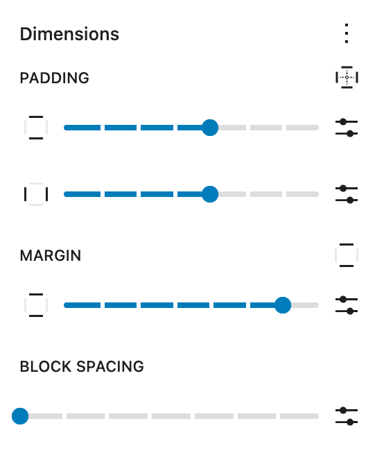
Not only does this make editing block’s spacing much easier, it also ensures a uniform experience. You no longer have to guess what sizes to use when creating pages/posts. You have a set of pre-defined, fluid sizes to use on virtually any block with ease.
Here are my spacing settings in my starter theme within my theme.json file:
"spacing": {
	"spacingSizes": [
		{
			"name": "Tiny",
			"size": "8px",
			"slug": "tiny"
		},
		{
			"name": "Small",
			"size": "16px",
			"slug": "small"
		},
		{
			"name": "Medium ( 32px / 24px )",
			"size": "clamp(24px, calc(1.5rem + ((1vw - 7.68px) * 1.5625)), 32px)",
			"slug": "medium"
		},
		{
			"name": "Large ( 32px / 48px )",
			"size": "clamp(32px, calc(2rem + ((1vw - 7.68px) * 3.125)), 48px)",
			"slug": "large"
		},
		{
			"name": "Extra Large ( 32px / 64px )",
			"size": "clamp(32px, calc(2rem + ((1vw - 7.68px) * 6.25)), 64px)",
			"slug": "x-large"
		},
		{
			"name": "2xl ( 32px / 80px )",
			"size": "clamp(32px, calc(2rem + ((1vw - 7.68px) * 9.375)), 80px)",
			"slug": "xx-large"
		},
		{
			"name": "3xl ( 48px / 96px )",
			"size": "clamp(48px, calc(3rem + ((1vw - 7.68px) * 9.375)), 96px)",
			"slug": "xxx-large"
		}
	],
	"blockGap": true,
	"padding": true,
	"margin": true
},
Rich Tabor has a great article on Site Spacing for theme.json that I suggest checking out.
I’ve chosen to define 7 spacing sizes for a reason. As long as there are less than or equal to 7 spacing options, you get a bit nicer UI in the editor (as pictured in the image a few paragraphs above). If you add any more than 7 spacing options, you end up with dropdowns for each spacing option, which is not nearly as nice of a UI compared to the step slider.
You’ll notice that starting with my “Medium” size I use CSS clamp to define the size. I include the min and max size in the “name” so it is easy to reference when using in the block editor.
Creating Fluid Headings in the WordPress Block Editor
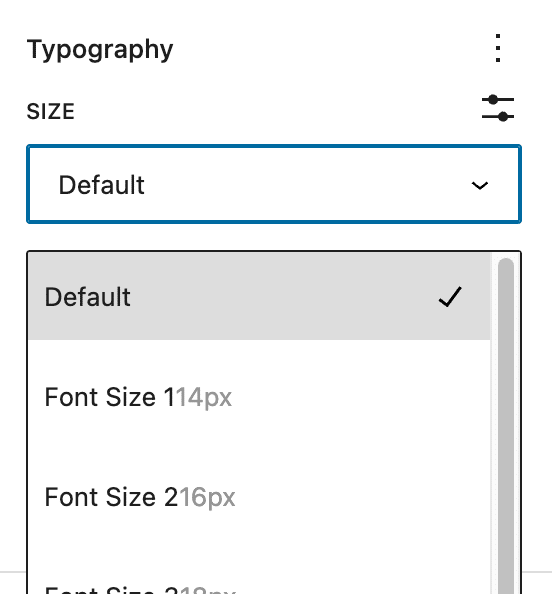
Using the same method I used for defining spacing, I can define default font sizes for the block editor:
"fontSizes": [
	{
		"name": "Font Size 1",
		"size": "14px",
		"slug": "font-size-1"
	},
	{
		"name": "Font Size 2",
		"size": "16px",
		"slug": "font-size-2"
	},
	{
		"name": "Font Size 3",
		"size": "18px",
		"slug": "font-size-3"
	},
	{
		"name": "Font Size 4",
		"size": "20px",
		"slug": "font-size-4"
	},
	{
		"name": "Font Size 5",
		"size": "24px",
		"slug": "font-size-5"
	},
	{
		"name": "Font Size 6",
		"size": "clamp(28px, calc(1.75rem + ((1vw - 6px) * 0.7042)), 32px)",
		"slug": "font-size-6"
	},
	{
		"name": "Font Size 7",
		"size": "clamp(30px, calc(1.875rem + ((1vw - 6px) * 1.0563)), 36px)",
		"slug": "font-size-7"
	},
	{
		"name": "Font Size 8",
		"size": "clamp(32px, calc(2rem + ((1vw - 6px) * 2.8169)), 48px)",
		"slug": "font-size-8"
	}
]
Notice that starting with “Font Size 6” I am using CSS Clamp to define the size. This gives any elements using Font Size 6, 7 or 8 fluid typography.
Then with a tiny bit of CSS you can set the proper pre-defined font-size to your headings:
h1 {
	font-size: var(--wp--preset--font-size--font-size-8);
}

h2 {
	font-size: var(--wp--preset--font-size--font-size-7);
}

h3 {
	font-size: var(--wp--preset--font-size--font-size-6);
}

h4 {
	font-size: var(--wp--preset--font-size--font-size-5);
}

h5 {
	font-size: var(--wp--preset--font-size--font-size-4);
}

h6 {
	font-size: var(--wp--preset--font-size--font-size-3);
}
Another benefit of this method is that you have the flexibility to resize headings as needed without losing proper semantic markup. If your design calls for a larger font size than your defined H3 size, but the semantic markup of the page warrants an H3, you can simply set the H3 to the size you want:
Using CSS Clamp for Block Spacing
The other huge application of CSS Clamp, for me, is using it when combined with Block Spacing. A huge amount of influence for this approach came from taking a look at Mike Mcalister’s Ollie theme. He does amazing things with the block editor and his use of spacing and Block Spacing property lead me down this path.
If you aren’t familiar with what Block Spacing is, it is essentially a way to define space between elements and was formerly referred to as blockGap (and this is what it is referred to in theme.json). This could mean the space between paragraphs, the horizontal space between columns or the space between a group of buttons.
There is a default Block Spacing value defined in my theme.json file, but you can easily override the default blockGap for any specific block on the styles tab using the blockGap setting under Dimensions.
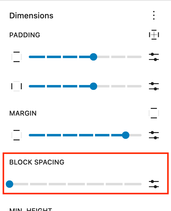
Notice that the “Block Spacing” option inherits the same Spacing options we defined in theme.json which are used for the margin and padding settings. This, again, provides the end user with a uniform way to handle spacing throughout their site.
I find the block spacing specifically helpful when combined with the group block. For example, if your default Block Spacing is 32px, but you have an area where you’d like the header to be slightly closer to the paragraph below it, you can simply wrap those two elements in a group block, then adjust the “Block Spacing” on the group block to the smaller size and it will override the default spacing and use the one defined on the wrapping group block.
Pretty cool, huh?
Combine this with the ability us use CSS Clamp for each spacing element and you have a very simple way to add fluid spacing between elements in the block editor.
Conclusion
As you can see, combining CSS Clamp with theme.json can be very powerful in creating fluid typography and fluid spacing throughout your site. This will decrease the need for bloated media queries and help the site perform better.
If you have any questions about CSS Clamp, the block editor or anything else feel free to comment below!
Defining Spacing and Font Sizes in theme.json is genius! Thank you for this post …
Writing the clamp formulas by hand is a bit tedious tho, you need a clamp generator or some sort of calculator tool for that.
This one seems simple and has a clean UI: https://www.xrilion.com/font-size-clamp
And I also prefer to sue REM instead of PX …
Appreciate the post!
Yep, a generator is a must. I’ve been using this one and it does the trick beautifully: https://websemantics.uk/tools/fluid-responsive-property-calculator/