This post is a follow-up to my post about creating a custom Gutenberg-like color picker using advanced custom fields. This updated method includes support for using theme.json instead of the deprecated editor-color-palette function.
Using this method will allow you to create a color picker for any block created using Advanced Custom Fields that mirrors the look of the block editor color picker.
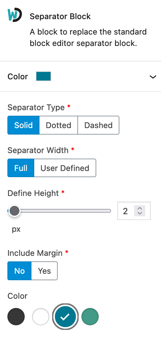
Here’s what it looks like:
Note: You can now use the core color functionality on any ACF block as documented here by Bill Erickson. I tend to default towards using the core functionality unless I need to add more than one color picker field to a custom block or it makes semantic sense to not use the core “background” or “text” color picker.
Step 1: Create an ACF radio field
First, we will create a simple ACF Radio Button field. You can name the field whatever you’d like, but make sure to make it simple, as you will be using that field name for any additional fields you intend to auto-populate in other blocks (or you will need to add multiple filters to ensure colors work properly on each field). Leave the choices blank for now as they will be automatically populated later.
Step 2: Populate the radio field with color palettes defined in theme.json
Next, we’ll automatically populate the radio field with the color palette defined in your theme.json file.
<?php
/**
 * ACF Radio Color Palette
 * @link https://www.advancedcustomfields.com/resources/acf-load_field/
 * @link https://www.advancedcustomfields.com/resources/dynamically-populate-a-select-fields-choices/
 * @link https://whiteleydesigns.com/create-a-gutenberg-like-color-picker-with-advanced-custom-fields-using-theme-json/
 *
 * Dynamically populates any ACF field with wd_editor_color_picker Field Name with custom theme.json palettes
 *
*/
add_filter('acf/load_field/name=wd_editor_color_picker', 'wd_acf_radio_color_palette');
function wd_acf_radio_color_palette( $field ) {

     // create color palette array
     $color_palette = [];

     // check if theme.json is being used and if so, grab the settings
     if ( class_exists( 'WP_Theme_JSON_Resolver' ) ) {
          $settings = WP_Theme_JSON_Resolver::get_theme_data()->get_settings();

          // full theme color palette
          if ( isset( $settings['color']['palette']['theme'] ) ) {
               $color_palette = $settings['color']['palette']['theme'];
          }

          // custom block color palette
          // if ( isset( $settings['blocks']['core/button']['color']['palette'] ) ) {
          //      $color_palette = $settings['blocks']['acf/acf-separator']['color']['palette'];
          // }
     }

     // if there are colors in the $color_palette array
     if( ! empty( $color_palette ) ) {

          // loop over each color and create option
          foreach( $color_palette as $color ) {
               $field['choices'][ $color['slug'] ] = $color['name'];
          }
     }

     return $field;
}
Let’s take a look at what this code is doing.
First, we add a filter that hooks into the acf/load_field/ function. We add the name of our ACF radio field (wd_editor_color_picker) to the filter to make sure this function only targets that specific field. You’ll want to change that field name to whatever you named your radio field. You can add multiple filters if you are using multiple radio fields with different names.
Then, we set an empty array as the $color_palette variable that we will later populate with the color palette options defined in theme.json.
Next, we check if the WP_Theme_JSON_Resolver exists and if so we set our $settings variable with the current theme’s theme.json settings.
Now that we have our theme.json settings in a variable we can extract what we need. You’ll see two different options (one commented out). The first option pulls in the default color palette defined in the theme.json settings ($settings['color'][palette']['theme']). The commented out option shows an example of how to pull a specific color palette from a different block.
One of the wonderful things about theme.json is that you can easily define color palettes that are scoped to specific blocks (even custom ACF blocks). I put this example in to show that you could pull in whatever color palette you’d like to use. So you could, in theory, create an ACF block, define a specific color palette for that custom block, and then on show those specific color palette options in your ACF color picker. Pretty cool, huh?
Now that we have the color palette we want set in the $color_palette variable, we loop over it and assign the slug and name to the ACF field choices. This is what automatically populates the ACF radio field with the proper choices from the color palette.
Step 3: Make the ACF radio field look like the block editor color picker
The last step is to create styles that will make the ACF Radio Field match the look of the Gutenberg / Block Editor color picker. I use SASS so you may need to refactor the below code if you use vanilla CSS.
Create an Admin Stylesheet
First, we’ll need to make sure the styles we are going to create are applied only within the WordPress Admin. I use the following function in my functions.php file to target my admin stylesheet and enqueue it within the WordPress Admin only. Make sure you adjust this to point to the admin CSS file you create.
<?php
// Admin Scripts (outside block editor)
function wd_admin_style() {

     wp_enqueue_style(
          'admin-styles',
          get_stylesheet_directory_uri().'/assets/css/admin.css',
          [],
          filemtime( get_stylesheet_directory() . '/assets/css/admin.css' ) // append timestamp for cache busting
     );
}
add_action( 'admin_enqueue_scripts', 'wd_admin_style' );
Create the admin styles
Here is the SASS I use to create the editor styles needed to make the ACF color picker look like a block editor color picker. You’ll notice lines 55-82 handle the colors of each input element based on the value. You’ll need to adjust this to match any additional/different color names that you use in your theme.json color palette.
You’ll also notice on lines 55-66 I target all “lighter” colors and change the color of the checkmark to black (or it would be invisible or hard to see as the default color is white.
/*----- ACF Radio Button Color Picker ---------------*/
.wp-admin .acf-block-component {

     ul.acf-radio-list {
          display: flex;
          flex-wrap: wrap;
          padding-left: 0;
          margin-left: 0;

          li {
               margin-right: 0;
               display: flex;
               flex-wrap: wrap;

               label {
                    width: 28px;
                    height: 28px;
                    position: relative;
                    margin: 6px 12px 6px 0;
                    color: white;

                    input[type="radio"] {
                         position: absolute;
                         top: 0;
                         left: 0;
                         width: 28px;
                         height: 28px;
                         border: 1px solid rgba(0,0,0,0.2);
                         @extend %transition;

                         &:hover {
                              transform: scale(1.2);
                         }

                         &:focus {
                              box-shadow: 0 0 0 2px white, 0 0 0 4px #757575;
                              border: 1px solid transparent;
                         }

                         &:checked {

                              &::before {
                                   content: "\f15e";
                                   font-family: dashicons;
                                   width: 20px;
                                   height: 20px;
                                   background-color: transparent;
                                   font-size: 20px;
                                   margin: 1px;
                                   color: white;
                              }
                         }

                         // override light colors with a black checkmark when checked (default is white)
                         &[value="background"],
                         &[value="white"],
                         &[value="grey-light"],
                         &[value="grey-medium"] {

                              &:checked {

                                   &::before {
                                        color: black;
                                   }
                              }
                         }

                         &[value="background"] {
                              background-color: var(--wp--preset--color--background);
                         }

                         &[value="foreground"] {
                              background-color: var(--wp--preset--color--foreground);
                         }

                         &[value="primary"] {
                              background-color: var(--wp--preset--color--primary);
                         }

                         &[value="secondary"] {
                              background-color: var(--wp--preset--color--secondary);
                         }
                    }
               }
          }
     }
}
Using these styles in custom ACF blocks
Since all we are really doing is modifying the look of the field, you can use this in your block/theme files as you would any normal ACF Radio Field.
If you are targeting a background color you would want to do something like has-background has-{color}-background-color. If you are targeting text colors you would want to add a class like has-text-color has--{color}-color.
Using these standard Block Editor classes will ensure consistency throughout the site and keep your CSS leaner.