This method does not work well with theme.json. If you use theme.json I suggest checking out this post with an updated method that supports theme.json.
One of my goals with each custom block I build with ACF is to try to make it as close to the normal block editor experience as I can. This tutorial will walk through using an ACF Radio Field to create a Gutenberg-like color picker.
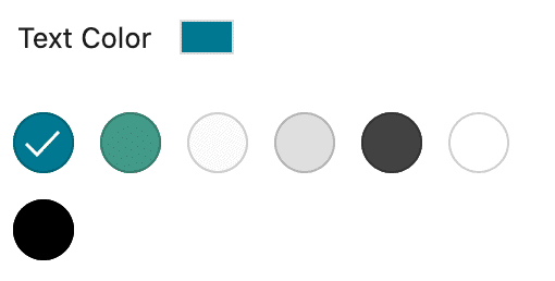
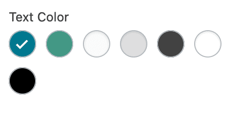
Here is what we are trying to accomplish:
Block Editor Color Picker
ACF Radio Color Picker
What we’ll cover:
- Creating a re-usable ACF field for color selection fields
- Dynamically populating your field with pre-defined block editor colors
- Styling the radio field to mirror the look of the core block editor color picker
Step One: Create a Simple, Reusable Radio Field
First, we will create a simple ACF Radio Button field. You can name the field whatever you’d like, but make sure to make it simple, as you will be using that field name for any additional fields you intend to auto-populate in other blocks. You do not need to enter any “Choices” when creating this field as those will be automatically populated later.
You can create this field on it’s own, as part of a custom block, as an option, as part of a repeater or even flexible content as long as the “Field Name” matches the filter we’ll create in the next step.
Step Two: Dynamically Populate the Radio Options with Gutenberg Color Palette
First, we will assume that you are using edit-color-palette to define your custom colors. If not, check out this post. This method won’t work if you are aren’t defining your color palette using this method.
Next, we dynamically populate the field we created in step one using acf/load_field by targeting the field name (wd_text_color in my example below).
<?php
/**
 * ACF Radio Color Palette
 * @link https://www.advancedcustomfields.com/resources/acf-load_field/
 * @link https://www.advancedcustomfields.com/resources/dynamically-populate-a-select-fields-choices/
 * @link https://whiteleydesigns.com/create-a-gutenberg-like-color-picker-with-advanced-custom-fields
 *
 * Dynamically populates any ACF field with wd_text_color Field Name with custom color palette
 *
*/
add_filter('acf/load_field/name=wd_text_color', 'wd_acf_dynamic_colors_load');
function wd_acf_dynamic_colors_load( $field ) {

     // get array of colors created using editor-color-palette
     $colors = get_theme_support( 'editor-color-palette' );

     // if this array is empty, continue
     if( ! empty( $colors ) ) {

          // loop over each color and create option
          foreach( $colors[0] as $color ) {
               $field['choices'][ $color['slug'] ] = $color['name'];
          }
     }

     return $field;
}
How does this work?
First, we are using the acf/load_field filter to target any ACF field that has a name of wd_text_color. You’ll want to change that value to match the field name you chose in step one.
Next, on line 15 we set the editor-color-palette array as variable called $colors. This gets all the color values including the name and slug from the custom colors we’ve already set up.
Then on line 18, we check to ensure the $colors variable isn’t empty. If it is, skip over the loop and return.
If the $colors variable isn’t empty, we loop over each array item and set the choices using the slug and name of the colors defined in the custom color palette.
Now, any time we create an ACF field with a field name that matches the name defined in this filter, the choices will automatically match that of our pre-defined color palette.
Step 3: Styling the Radio Fields to Match the Block Editor
The last step is to create styles that will make the ACF Radio Field match the look of the Gutenberg / Block Editor color picker. I suggest using SASS as it provides a simple way to loop over the colors, but it can be done with pure CSS as well. The example below uses SASS.
Create an Admin Stylesheet
First, we’ll need to make sure the styles we are going to create are applied only within the WordPress Admin. I use the following function in my functions.php file to target my admin stylesheet and enqueue it within the WordPress Admin only:
<?php
function wd_admin_style() {
     wp_enqueue_style( 'admin-styles', get_stylesheet_directory_uri().'/assets/css/admin.css' );
}
add_action( 'admin_enqueue_scripts', 'wd_admin_style' );
You will want to change the directory to ensure it is pointing to the file you have created. Note that the file above is the output file from the SASS partial that will be shown below.
Create the Styles
Next we’ll add the following SASS to partial that will be compiled in to your admin CSS output file above:
/*----- ACF Radio Button Color Picker ---------------*/
.wp-admin .acf-block-component {

     ul.acf-radio-list {
          display: flex;
          flex-wrap: wrap;
          padding-left: 0;
          margin-left: 0;

          li {
               margin-right: 0;
               display: flex;

               label {
                    width: 28px;
                    height: 28px;
                    position: relative;
                    margin-right: 10px;
                    margin-bottom: 10px;
                    color: $white;

                    input[type="radio"] {
                         position: absolute;
                         top: 0;
                         left: 0;
                         width: 28px;
                         height: 28px;

                         &:checked {

                              &::before {
                                   content: "\f15e";
                                   font-family: dashicons;
                                   width: 20px;
                                   height: 20px;
                                   background-color: transparent;
                                   font-size: 20px;
                                   margin: 1px;
                                   color: $white;
                              }
                         }

                         // override light colors with a black checkmark when checked (default is white)
                         &[value="white"],
                         &[value="grey-light"],
                         &[value="grey-medium"] {

                              &:checked {

                                   &::before {
                                        color: $black;
                                   }
                              }
                         }

                         @each $name, $color in $colors {

                         	&[value="#{$name}"] {
                         		background-color: $color;
                         	}
                         }
                    }
               }
          }
     }
}
A few quick notes about the above SASS:
You’ll notice variables for $white and $black. If you don’t have those variable set, you can change them to just white or black.
Lines 44-46 target the light/white colors in the array and change out the check mark color to black when they are selected .This prevents having a white check mark on a white background.
On line 56-61 you will see the magic of SASS. This loops over the colors I have defined in the snippet below and applies the proper background color to each radio option. If you aren’t using SASS you could define each of these manually by replacing the #{name} with the name of the color and $color with the HEX code for the color. Repeat that process for each color in your color palette.
Here is how I define the colors in my variables partial:
<?php
// Block Coloring
$white: #fff;
$black: #000;
$grey-light: #fafafa;
$grey-medium: #e0e0e0;
$grey-dark: #424242;
$primary-color: #007991;
$secondary-color: #439a86;

$colors: ( primary-color, $primary-color ),
	     ( secondary-color, $secondary-color ),
         ( grey-light, $grey-light ),
         ( grey-medium, $grey-medium ),
         ( grey-dark, $grey-dark ),
         ( white, $white ),
         ( black, $black );
You’ll want to change these values out to match what you have defined in your edit-color-palette function.
Using these values in your blocks/themes
Since all we are really doing is modifying the look of the field, you can use this in your block/theme files as you would any normal ACF Radio Field.
If you are targeting a background color you would want to do something like has-{color}-background-color. If you are targeting text colors you would want to add a class like has-{color}-color.
Using these standard Block Editor classes will ensure consistency throughout the site and keep your CSS leaner.
This is awesome! Just what I need. Thanks!
Great solution. I’m surprised that ACF hasn’t added the option to choose between their standard color picker and a Gutenberg style UI. Being able to pull in the existing values from the editor-color-palette is icing on the cake.
Hi , Matt.
An alternative, based in our old solution.
https://carlosmdh.es/en/snippets/como-sincronizar-la-paleta-de-colores-de-los-bloques-creados-con-acf/
Greetings
Hey Carlos,
I used a very similar method previously. While it does simulate the look of the color picker, it doesn’t afford the same functionality.
It doesn’t user the same classes as the color pickers (ie. has-blue-color or has-blue-background-color) since it has to use inline styles. Additionally, it doesn’t auto-sync with your defined Gutenberg color palette, which I think is a huge benefit of the above method.
With that said, that is a simple method of mimicking the look using the default ACF color picker! So nice work.
Cheers,
Matt
This helped me a lot. Simple and handy 🙂 Thanks Matt!
Would love to see this updated to work with theme.json instead of registering it via a function!
Hey Andrew. There would be no way to do this with theme.json. theme.json is used to modify the core block editing experience. This article is in reference to creating a similar “color picker” experience when using blocks created with Advanced Custom Fields.
Hey Andrew – updated post with a new method that works with theme.json. 🙂
https://whiteleydesigns.com/create-a-gutenberg-like-color-picker-with-advanced-custom-fields-using-theme-json/