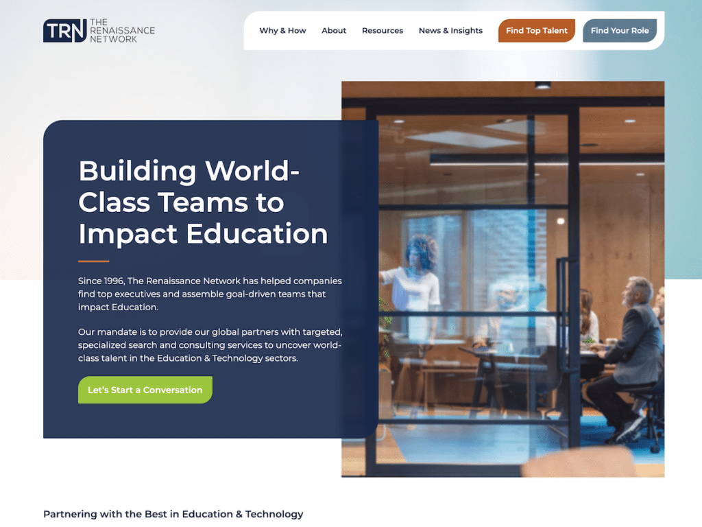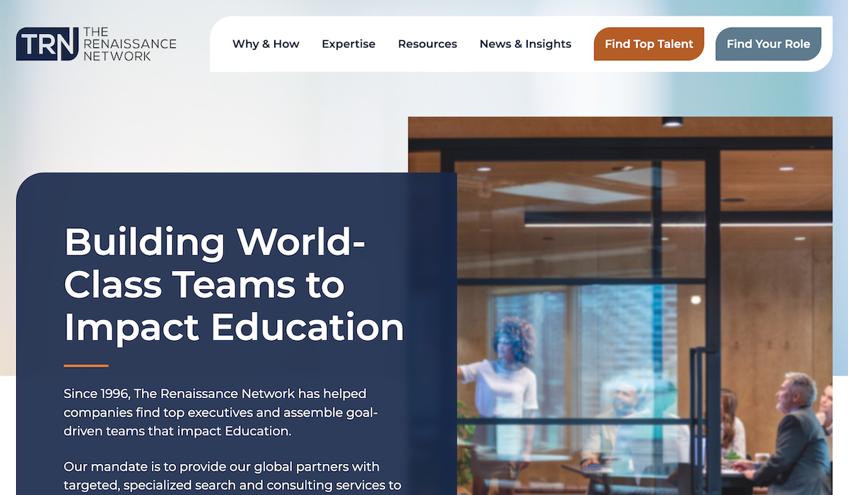
TRN was looking for a complete overhaul and revamp of their dated website. With the help of Corey Tiani, the site is now modern with a optimized user experience that drives traffic to the main goals of the TRN team.
Project Highlights
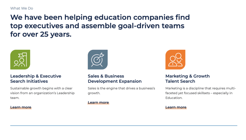
Beautiful Iconography
Simple, yet elegant iconography with a mix of branded colors.
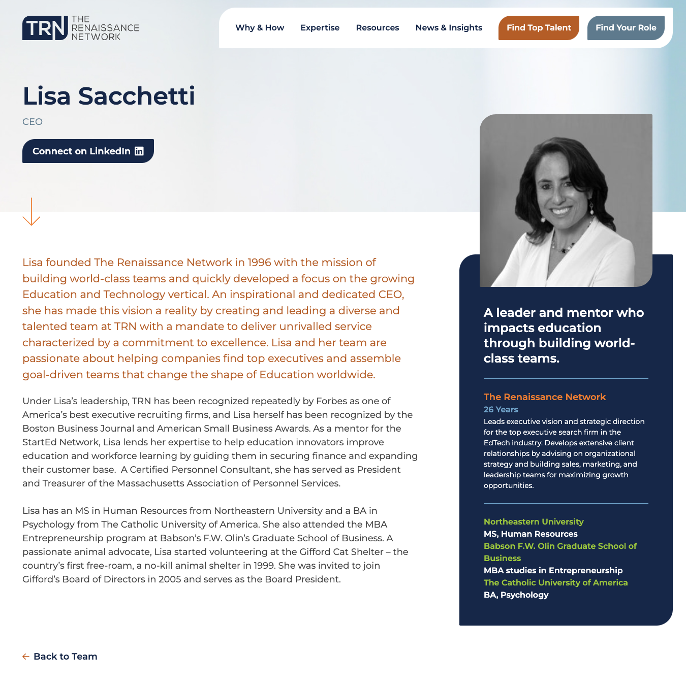
Focus on the TRN Team
Customized team profiles help highlight the strength and expertise of the brains behind The Renaissance Network.
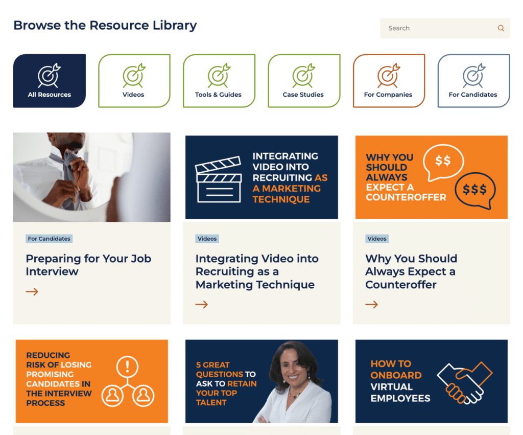
Overhauled Resource Library
A fully overhauled and re-organized resource library makes it easy for users to browse the types of free resources offered by TRN.
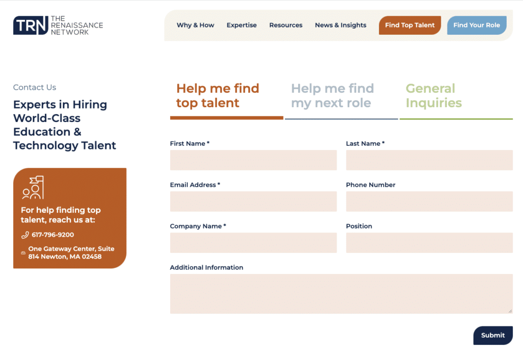
Multi-layered contact page
A multi-layered contact page enables users to query exactly what they want making for a better user experience and a strong, optimized lead generation tool.
